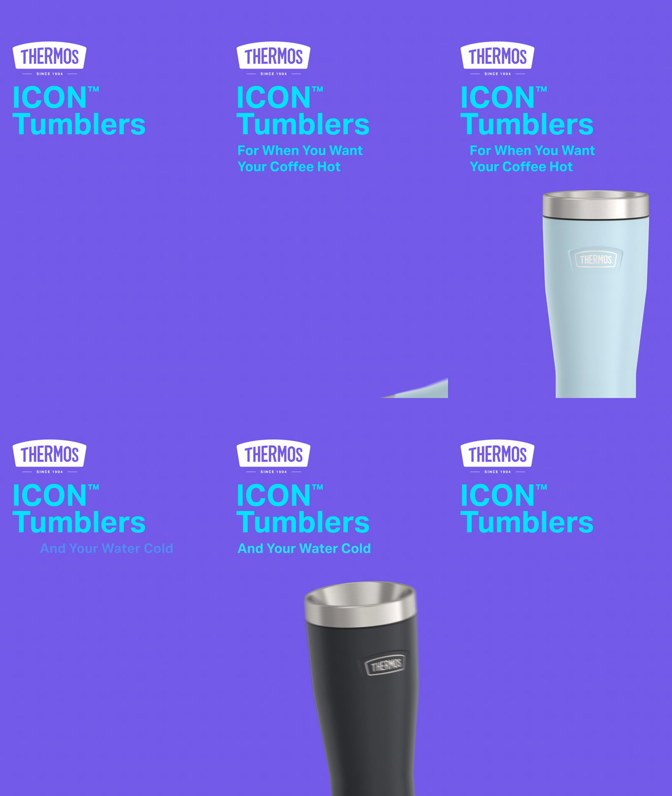
Thermos
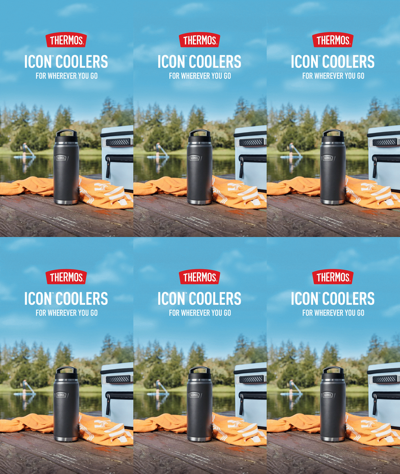
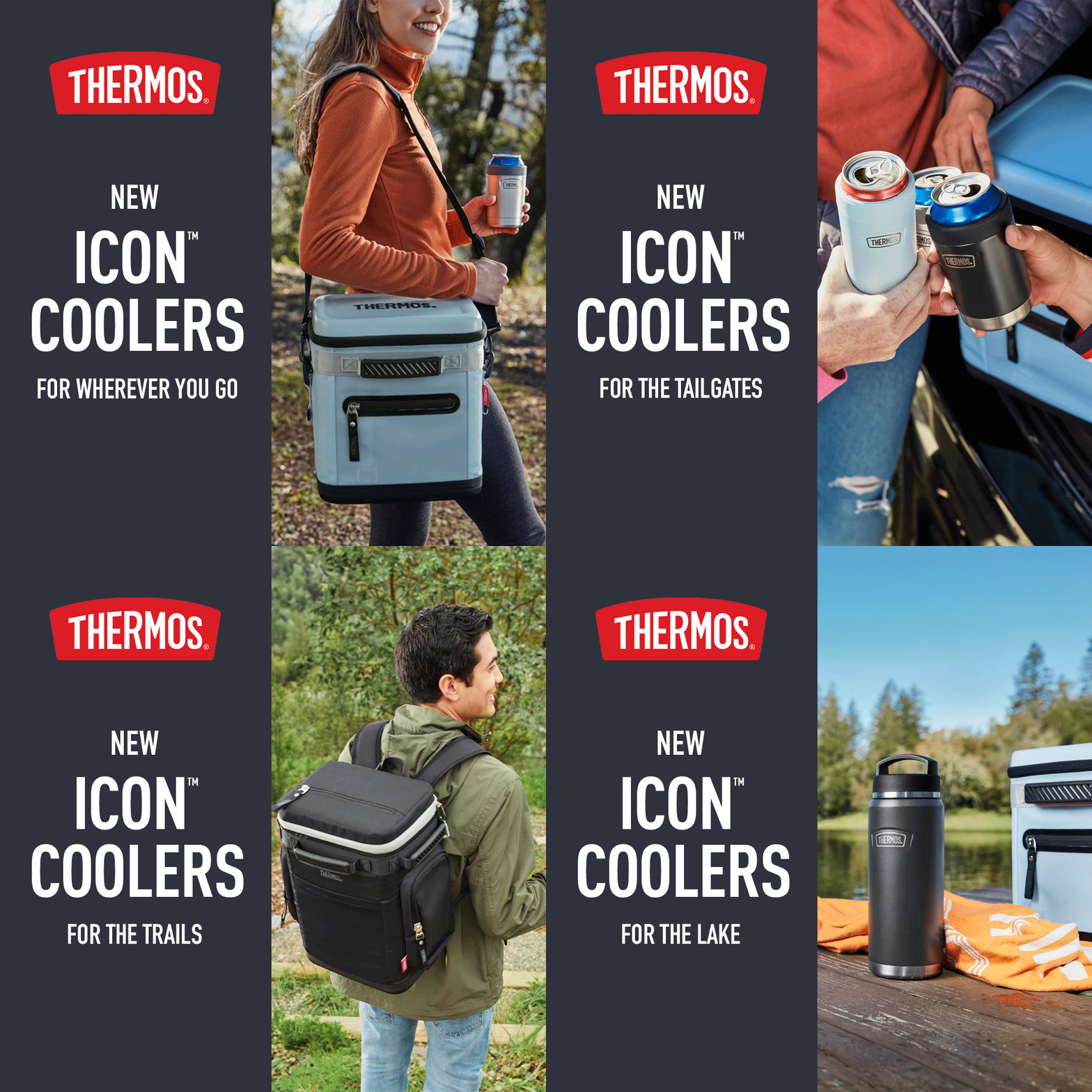
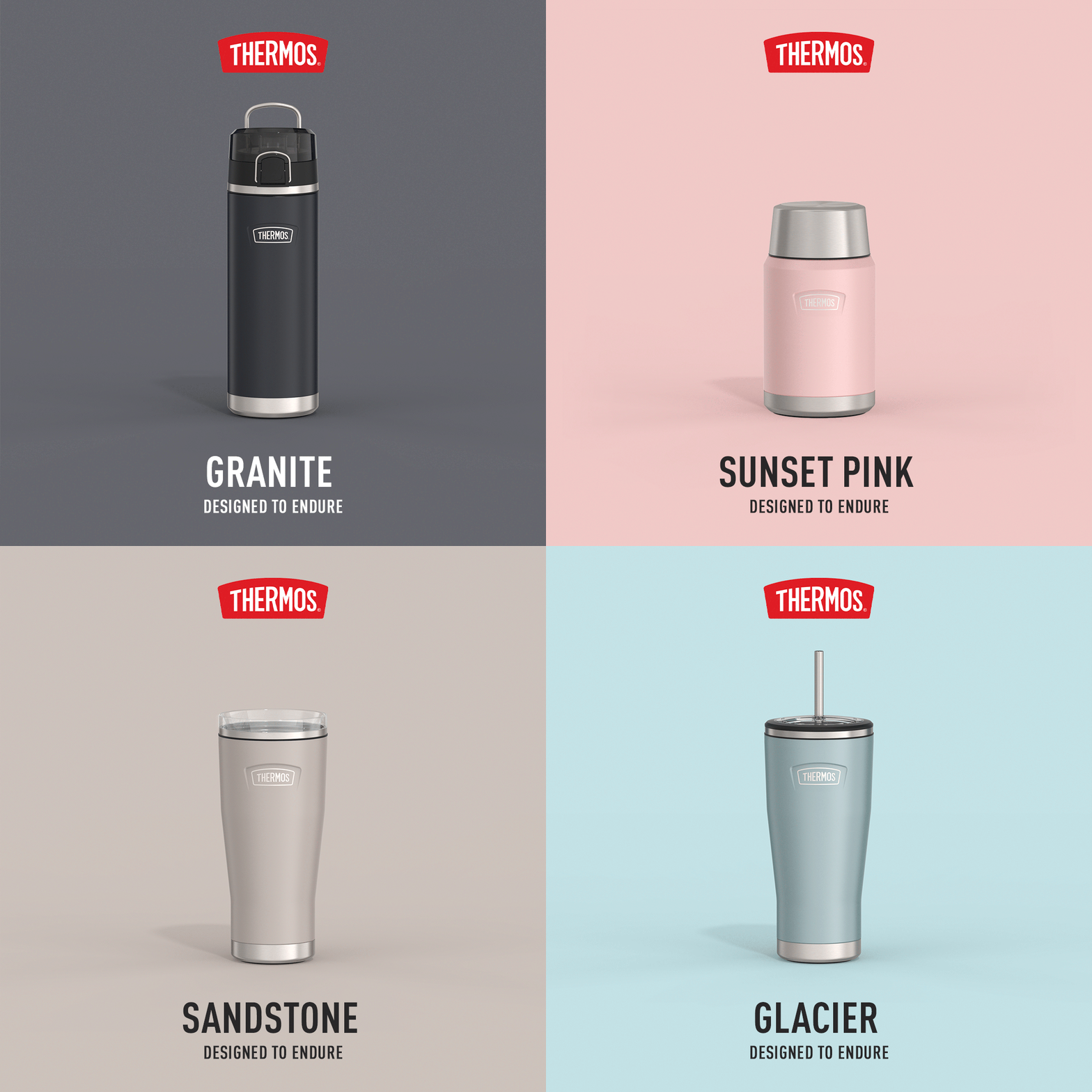
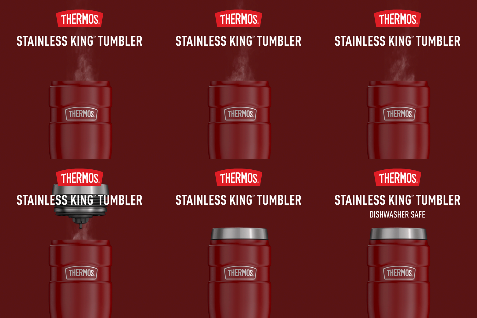
Who doesn’t know Thermos? Their iconic name used as a general synonym for insulated canisters sets them apart from the rest and can be found in almost every home across the country. Their visual approach is straight, no nonsense and clearly communicated, but also includes friendlier approaches such as in their Care™ campaign. Working on their ad assignments was much different than the beauty brands I was used to, since Thermos is so rooted in American culture itself and knows it’s way around the advertising space visually. They have wonderful, minimal fonts, logos and striking photos to work with, which makes for a unique project that can challenge you in ways you don’t expect.
The challenges that came from working with Thermos came early in my career. Initially I learned that they have a very specific set of brand rules, and that I had to sometimes decode what their team was looking for in a deliverable. Through a rigorous process of meetings, multiple versions, many rounds of feedback, and working with a team of strategists, we finally found a routine and process that works great for them. More importantly, we learned that communication and patience is key to building a great working relationship and visual product.
